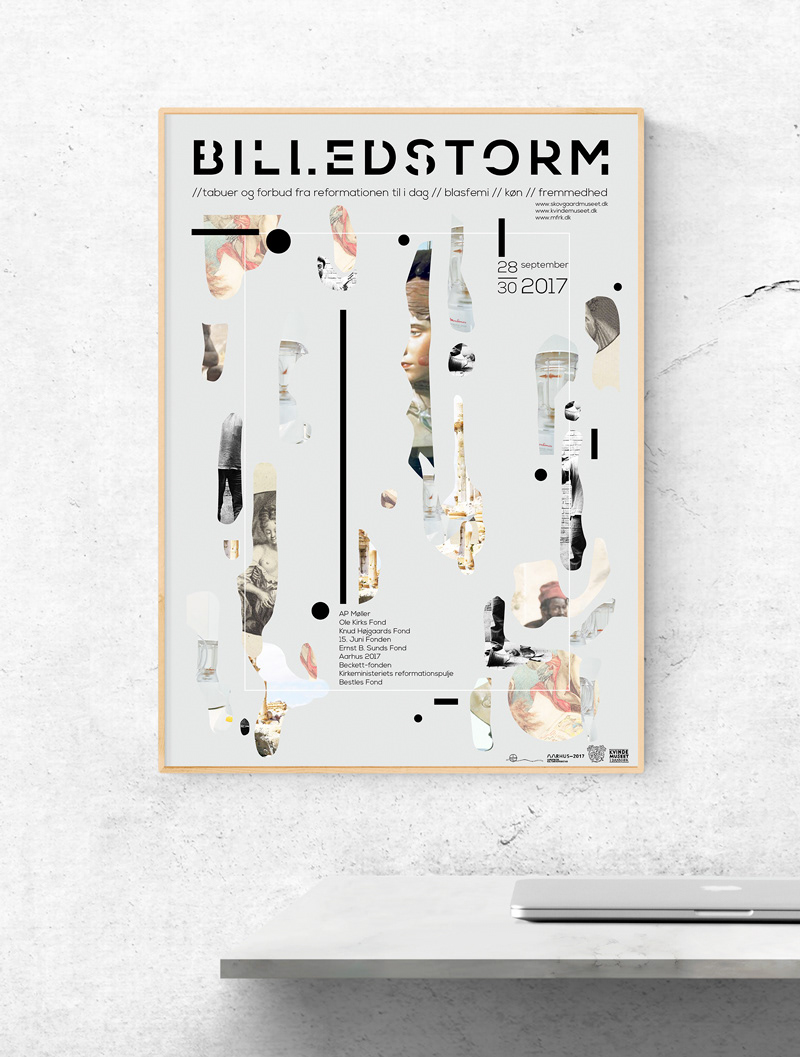
I was asked to design a possible identity for three museums uniting for one exhibition. The exhibition revolved around iconoclasm.
Censorship was a cornerstone in the design process of this logo. I have used a sharp and strong font as the base to resemble the artworks that were censored in that periode which were strong (otherwise there would be no reason that parts had to be hidden) I started with the strong base and then I started to censor the different letters. I’ve picked up small pieces away and left voids / holes. I visualized censorship
The font Nexa is iconoclasm / Image Storms primary style. I have chosen it because I think it fits well with the theme of censorship. Censorship exudes rules tightness, control and regelrettethed.
Image colors // I decided to use the original images for the authenticity. However the images are toned and lighter so it makes it a little easier to get so many different images to be cohesive together without making to much noise.
Fragments // I chose to use fragments and shapes to create a dynamic composition. One of the things that was important to me was to show some of the various works that have been subject to censorship. I wanted to give the viewer the feeling that they would like to see more, giving them the feeling that something has been censored. I also want to activate their brains in such a way that they open up and become curious. Sometimes you if you given answers too quickly, it makes the brain becomes lazy and thus begins to be bored.
White frame // The white frame on the leaflet, helps hold all the elements together, it constitutes an anchor. I have used it as another symbol for censorship and at the same time giving space for information.